1Introduction
If you're a business owner who has ever stared at a marketing dashboard and felt completely overwhelmed by the sea of numbers, charts, and jargon, you're not alone. Most marketing dashboards are built by data people for data people, which means they're optimized for comprehensiveness rather than clarity. They track every possible metric, use technical terminology without explanation, present multiple visualization types without context, and generally assume that everyone looking at them has a background in analytics. The result is that business owners who just want to know whether their marketing is working and what they should do differently end up feeling intimidated and disengaged from the very data that should be empowering them to make better decisions. This is a solvable problem, but it requires understanding a few key principles about how to read dashboards effectively and what questions to ask.
The good news is that you don't need to become a data analyst to extract actionable insights from your marketing dashboards. You don't need to understand statistical significance, confidence intervals, regression analysis, or any of the technical concepts that data professionals use. What you do need is a simple framework for identifying the numbers that actually matter for your business, a basic understanding of how to read trends and spot anomalies, and the discipline to establish a review rhythm that keeps you informed without drowning you in data. According to a 2024 survey by the Business Intelligence Institute, business owners who establish a consistent weekly dashboard review process report 60% higher confidence in their marketing decisions compared to owners who only look at dashboards occasionally or when there's a crisis. The difference isn't that they understand statistics better, it's that they've developed pattern recognition by looking at the same key metrics in the same format every week until the normal patterns become obvious and deviations immediately stand out.
This article will walk you through a practical approach to reading marketing dashboards without requiring any technical background. We'll start with the five core numbers that every business owner should check weekly, then cover how to read trend lines and time comparisons, explain the most common chart types and what they tell you, teach you how to spot anomalies versus normal variation, and show you how to build a review rhythm that keeps you informed without overwhelming you. By the end, you'll be able to open your marketing dashboard with confidence instead of dread and extract the insights you need to guide your marketing strategy and hold your team accountable.
Senova's dashboards show what matters without the jargon.
2The Five Numbers Every Business Owner Should Check Weekly
Let's start with radical simplification. Despite what your marketing dashboard might suggest by showing you 47 different metrics, there are really only five numbers you need to check every single week as a business owner. These five metrics give you a complete picture of your marketing health without overwhelming you with detail. They're traffic trend, lead volume, cost per lead, conversion rate, and pipeline value. If you check nothing else, check these five numbers every Monday morning and you'll know whether your marketing is on track or needs attention. Everything else on your dashboard is either a diagnostic metric for your marketing team to optimize, a vanity metric that doesn't really matter, or a detailed breakdown of one of these five core numbers.
Traffic trend tells you whether the number of people visiting your website is going up, staying steady, or going down. Note that this is the trend direction and magnitude, not the absolute number. It doesn't matter much whether you had 4,327 visitors last week or 4,891 visitors, what matters is whether that's up or down from the previous weeks and by how much. Stable or growing traffic means your marketing activities are maintaining or building awareness and interest. Declining traffic means you have a problem that needs diagnosis, either your campaigns are underperforming, your organic rankings are dropping, your email list is disengaging, or external factors are affecting your market. Traffic trend is best visualized as a line chart showing weekly or daily traffic over the past three to six months, which makes the overall direction and recent changes obvious at a glance.
Lead volume tells you how many qualified prospects expressed interest in your product or service by filling out a form, requesting a demo, starting a trial, or taking whatever action you define as becoming a lead. Again, the trend matters more than the absolute number. Growing lead volume means your conversion tactics are working and you're building your sales pipeline. Flat lead volume means you're maintaining but not growing. Declining lead volume is an early warning that your sales pipeline will be thin in the coming weeks or months. Lead volume is best tracked as a bar chart showing leads per week over the past quarter, with a trend line to make the direction clear.
Cost per lead tells you how much you're spending in marketing to acquire each lead. This is calculated by dividing your total marketing spend by your total number of leads in the same period. Cost per lead is your primary efficiency metric, telling you whether you're getting more or less efficient at converting marketing dollars into prospects. Declining cost per lead means you're getting better at targeting, messaging, or channel selection. Rising cost per lead means you're getting less efficient, either because ad costs are increasing, your conversion rates are dropping, or you're expanding into less effective channels. Cost per lead should be tracked as a line chart over time, with a target range indicated so you can see when you're above or below your acceptable cost range.
Conversion rate tells you what percentage of your leads become paying customers. This is calculated by dividing new customers by leads in the same period, accounting for your typical sales cycle length. Conversion rate tells you how well your sales process is working and whether your leads are actually qualified. A stable or improving conversion rate means your targeting is good and your sales team is effectively closing deals. A declining conversion rate means either your lead quality is dropping, your sales process has friction, your product-market fit is weakening, or your competitors are winning more deals. Conversion rate is best shown as a line chart over time with your target conversion rate indicated as a reference line.
Pipeline value tells you the total dollar amount of all active sales opportunities in your sales pipeline. This is calculated by adding up the potential value of all open deals, often weighted by their probability of closing. Pipeline value is your forward-looking revenue indicator. Growing pipeline value means your future revenue is likely to grow. Declining pipeline value means you're likely to miss revenue targets in coming months unless something changes. Pipeline value should be tracked as a line chart over time, ideally with indicators showing how it breaks down by sales stage so you can see if deals are moving through your pipeline or getting stuck.
These five metrics are powerful because they're comprehensive while still being simple. Traffic and lead volume tell you whether your marketing is generating enough activity. Cost per lead tells you whether you're doing it efficiently. Conversion rate tells you whether the activity is quality. Pipeline value tells you whether it's translating into future revenue. If all five numbers are heading in the right direction, your marketing is working. If any of them are heading in the wrong direction, you know where to focus your attention. You don't need 47 metrics to run your business, you need these five checked consistently.
3Reading Trend Lines: Direction and Rate of Change
Once you know which numbers to look at, the next skill is learning to read trend lines effectively. A trend line is simply a line chart that shows how a metric has changed over time. The horizontal axis represents time (days, weeks, or months), and the vertical axis represents the value of your metric. The line connects the data points to show the overall pattern. Trend lines are the single most useful visualization type for business owners because they make patterns immediately obvious in a way that tables of numbers never do. When someone shows you a table that says your leads were 127, 142, 119, 156, 138, it takes mental effort to figure out what's happening. When someone shows you a trend line of the same data, you immediately see whether it's going up, down, or sideways.
The first thing to look for in a trend line is the overall direction. Is the line generally moving up and to the right, generally moving down and to the right, or generally staying flat? This tells you the fundamental story of what's happening with that metric. The second thing to look for is the rate of change. A line that's slowly drifting upward is different from a line that's rapidly shooting upward. A line that's gradually declining is different from a line that's falling off a cliff. The rate of change tells you how urgent the situation is. A slow drift might be something to monitor and address in your next strategy session. A rapid change probably needs immediate attention.
The third thing to look for is inflection points, which are spots where the trend changes direction. If your traffic was growing steadily for three months and then suddenly started declining two weeks ago, that inflection point is the most important thing on your chart because it tells you exactly when something changed. Your job is to figure out what happened at that time that might explain the change. Did you pause a campaign? Did Google update their algorithm? Did a competitor launch? Did you change something on your website? Inflection points are breadcrumbs that lead you to root causes. According to a 2024 study by the Marketing Analytics Institute, business owners who are trained to spot and investigate inflection points in their trend lines identify and fix marketing problems 40% faster than business owners who just look at current values without considering historical patterns.
One common mistake in reading trend lines is overreacting to short-term variation. Every metric has natural day-to-day or week-to-week variation that doesn't mean anything. Your leads might be 32 one week and 28 the next week not because something changed but just because of random variation in when people happen to submit forms. Your traffic might be higher on Tuesday than Wednesday because of day-of-week patterns. The way to avoid overreacting is to look at the trend over a longer period, usually at least three months, and ask whether the recent variation is outside the normal range of variation you've seen historically. If your weekly leads are normally between 25 and 40, and this week was 28, that's just normal variation. If this week was 12, that's an anomaly that needs investigation.
Another useful technique for reading trend lines is comparing multiple metrics on the same chart to see how they relate. If you plot traffic and leads on the same chart, you can see whether they move together or independently. If traffic goes up but leads don't, that tells you that your traffic quality or conversion rate is declining. If leads go up but traffic stays flat, that tells you that your conversion rate is improving. These relationships between metrics often reveal what's really happening in your marketing better than looking at any single metric in isolation. Most modern dashboard tools allow you to overlay multiple metrics on the same chart with dual vertical axes, which makes these comparisons easy.
4Understanding Time Comparisons: Week-Over-Week, Month-Over-Month, Year-Over-Year
Time comparisons are how you quantify whether your metrics are getting better or worse. Instead of just looking at the absolute value of a metric, you compare it to the same metric from a previous time period to see how much it changed. The three most common time comparisons are week-over-week (compare this week to last week), month-over-month (compare this month to last month), and year-over-year (compare this month to the same month last year). Each type of comparison serves a different purpose and reveals different patterns. Learning when to use which comparison is key to extracting the right insights from your dashboards.
Week-over-week comparisons are useful for catching short-term changes and responding quickly to problems or opportunities. If your cost per lead this week is 40% higher than last week, that's something you want to know about immediately so you can investigate what changed and fix it before you waste a lot of budget. Week-over-week is the right comparison for your leading indicators and tactical metrics that you're actively optimizing. The downside of week-over-week is that it can be noisy because of natural weekly variation, so you need to be careful not to overreact to small changes. A good rule of thumb is that changes of less than 20% week-over-week are probably just noise unless you have a specific reason to think something changed. Changes above 30% are usually real signals that need investigation.
Month-over-month comparisons smooth out weekly noise while still being recent enough to be actionable. If your lead volume this month is 15% lower than last month, that's a meaningful signal that your pipeline might be weakening. Month-over-month is the right comparison for intermediate metrics like lead volume, pipeline value, and conversion rates that you expect to be relatively stable but want to track for gradual improvement or degradation. The downside of month-over-month is that it doesn't account for seasonal patterns. If your business has strong seasonality, month-over-month comparisons can be misleading because you might be down compared to last month simply because you're entering a slower season, not because your marketing is underperforming.
Year-over-year comparisons account for seasonal patterns by comparing each month to the same month from the previous year. If your leads in March this year are 25% higher than March last year, that's a strong signal that your marketing is genuinely improving, even if March is typically slower than February. Year-over-year is the right comparison for strategic metrics and overall business performance because it controls for seasonality and gives you a clean read on whether you're growing or not. The downside of year-over-year is that it's backward-looking and slow to respond to recent changes. If something important changed in the last month, year-over-year won't show it yet because you're comparing to what happened a year ago.
The most sophisticated dashboard users combine all three time comparisons to get a complete picture. A typical weekly review might look at week-over-week changes for operational metrics like cost per lead and traffic, month-over-month changes for pipeline metrics like lead volume and conversion rate, and year-over-year changes for strategic metrics like revenue and customer growth. This layered approach lets you catch short-term problems quickly, track medium-term trends, and validate long-term growth all from the same set of metrics. It also helps you distinguish between different types of changes. If you see a week-over-week drop that doesn't show up in month-over-month or year-over-year, it's probably just weekly noise. If you see consistent drops across all three time comparisons, it's definitely a real problem that needs immediate attention.
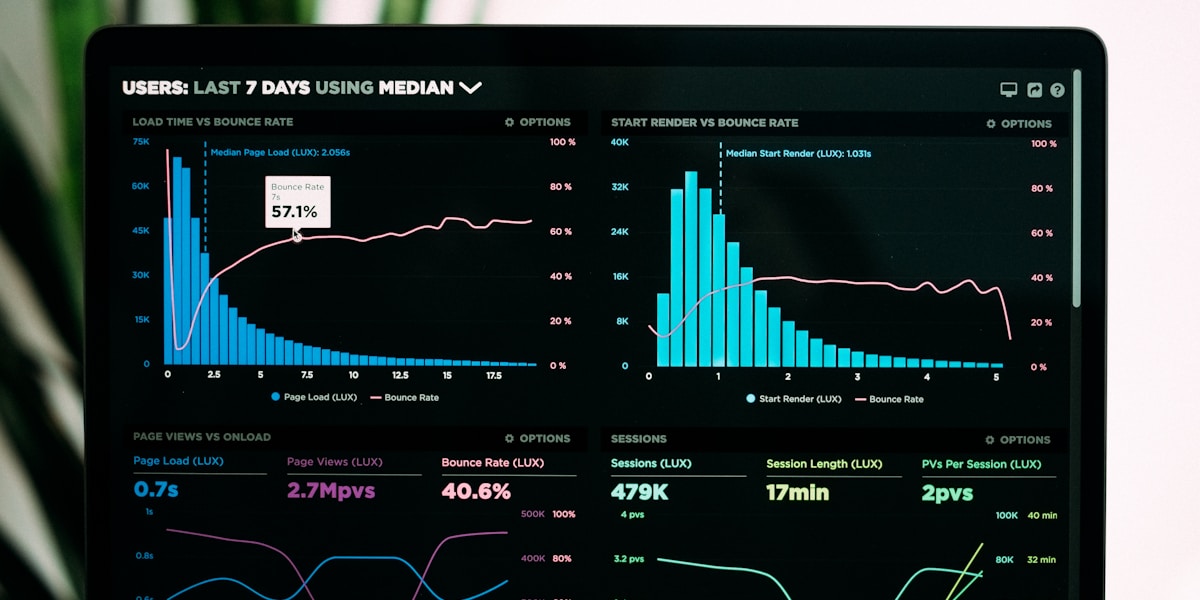
5Common Chart Types: Line, Bar, Funnel, Pie, Heatmap
Understanding the different chart types that appear on marketing dashboards helps you extract insights more quickly because each chart type is designed to reveal different patterns. The five most common chart types on marketing dashboards are line charts, bar charts, funnel charts, pie charts, and heatmaps. Each has specific strengths and weaknesses, and knowing what each one is good for helps you know where to look for the insights you need.
Line charts show how a metric changes over time. The horizontal axis is time, the vertical axis is the value of your metric, and the line shows the trend. Line charts are the best choice for any metric that you want to track over time to see trends, patterns, and changes. They make it immediately obvious whether something is going up, going down, staying flat, accelerating, or decelerating. They also make it easy to compare multiple metrics on the same chart by plotting multiple lines. The main limitation of line charts is that they can get cluttered if you try to plot too many metrics at once, and they don't show categorical breakdowns as well as other chart types.
Bar charts show comparisons between different categories or time periods. Each bar represents one category or one time period, and the height of the bar represents the value. Bar charts are excellent for comparing performance across different channels, campaigns, or audience segments. They make it visually obvious which category is performing best and which is performing worst. They're also good for showing week-by-week or month-by-month performance when you want to emphasize the discrete time periods rather than the continuous trend. The main limitation of bar charts is that they don't show trends as clearly as line charts, so if you're primarily interested in the direction and rate of change, a line chart is usually better.
Funnel charts show how many people progress through sequential stages of a process. The typical marketing funnel might show visitors at the top, then leads, then opportunities, then customers, with each stage narrower than the previous one to represent drop-off. Funnel charts are excellent for identifying where you're losing people in your conversion process. If the drop-off from visitors to leads is proportionally much larger than the drop-off from leads to opportunities, that tells you that your lead capture is the weak point and that's where you should focus optimization efforts. The main limitation of funnel charts is that they show a single time period or aggregate performance, so they don't show trends over time without multiple funnels side by side.
Pie charts show how a total is divided into different categories. Each slice of the pie represents one category, and the size of the slice represents what percentage of the total that category represents. Pie charts are useful for showing channel mix, traffic source breakdown, or any situation where you want to see what proportion of your total each category represents. They make it immediately obvious if one category dominates or if things are evenly distributed. The main limitation of pie charts is that they're hard to read accurately when you have many small categories, and they don't show trends over time. According to data visualization research, most people also find it harder to compare slice sizes accurately compared to comparing bar heights, so bar charts are often a better choice even for categorical data.
Heatmaps use color intensity to show the value of a metric across two dimensions. A common marketing heatmap might show days of the week on one axis and hours of the day on the other axis, with the color intensity showing how many conversions happen at each day/hour combination. Heatmaps are excellent for revealing patterns that would be hard to see in tables or other chart types. They make it visually obvious that, for example, Tuesday afternoons convert much better than weekend mornings. They're particularly useful for time-based patterns, geographic patterns, and page performance analysis. The main limitation of heatmaps is that they sacrifice precision for pattern recognition. You can see that one cell is darker than another, but you can't easily read the exact values.
6Spotting Anomalies Versus Normal Variation
One of the most important skills in reading dashboards is learning to distinguish between anomalies that need investigation and normal variation that you should ignore. Every metric has some amount of natural variation from day to day or week to week. The number of leads you generate tomorrow won't be exactly the same as the number you generated today, even if nothing in your marketing changed. The question is how much variation is normal, and how much variation indicates that something actually changed. Reacting to every small variation leads to thrashing and constant false alarms. Ignoring real anomalies means you miss problems until they become crises.
The simplest way to spot anomalies is to look at historical ranges. If your weekly lead volume over the past six months has ranged from 25 to 45, and this week you got 8 leads, that's clearly an anomaly that needs investigation because it's far outside your historical range. If you got 31 leads, that's well within your normal range and probably doesn't mean anything. Many dashboard tools will show you the range or standard deviation of your metrics over time, which gives you a visual reference for what's normal. Some advanced tools will automatically flag anomalies using statistical methods, but you can usually spot them just by looking at whether the current value is substantially outside the range you've seen before.
The second technique for spotting anomalies is looking for sudden changes in the trend direction. If your cost per lead has been gradually declining for three months and suddenly jumps 40% in one week, that discontinuity is an anomaly even if the new value is still within your historical range. Something changed to break the trend, and you need to figure out what it was. Conversely, if your cost per lead has been bouncing between $80 and $120 for months with no clear trend, and this week it's $110, that's just normal variation even though $110 is at the high end of your range. The difference is whether there's a break in the pattern or just continuation of existing variability.
The third technique is considering whether you have a plausible explanation for the change. If your website traffic drops 30% on the same day that you pushed a site update that broke mobile rendering, that's clearly not a coincidence and the traffic drop is a real problem caused by the site issue. If your traffic drops 30% on a random Tuesday with no changes to your site, campaigns, or anything else you can think of, you need to investigate whether there's an external factor you don't know about yet or whether it's a tracking issue. The presence or absence of a plausible causal explanation helps you decide how seriously to take an apparent anomaly.
According to a 2024 study by the Marketing Measurement Institute, false positives (reacting to normal variation as if it were a real problem) and false negatives (ignoring real problems as if they were normal variation) each occur in about 30% of dashboard reviews by inexperienced users. The error rate drops to less than 10% for users who have been reviewing the same dashboards weekly for at least three months, not because they learn statistics but because they develop intuition for what's normal in their specific business. This is one of the strongest arguments for establishing a consistent weekly review rhythm. The more exposure you have to your normal patterns, the more obvious it becomes when something is genuinely abnormal.
See dashboards designed for decision-making, not data science.
7Filtering and Segmentation Basics
Most marketing dashboards allow you to filter and segment your data to look at different subsets of your overall performance. Filtering means narrowing your data to show only records that meet certain criteria, like "only show data from email campaigns" or "only show data from mobile visitors." Segmentation means breaking your data into groups based on some attribute, like showing traffic broken down by channel or showing conversion rate broken down by device type. Learning to use filtering and segmentation effectively dramatically increases the value you can extract from your dashboards because it lets you move from "what happened" to "what happened for which specific groups."
The most common and valuable filters are time period, traffic source, and campaign. Time period filtering lets you zoom in on specific ranges to investigate anomalies or compare different periods. If you see that your conversion rate dropped in November, filtering to show only November data lets you investigate what happened during that specific month without the noise of other time periods. Traffic source filtering lets you isolate performance of specific channels. If your overall cost per lead increased, filtering to show only paid search might reveal that paid search costs spiked while other channels stayed stable, which tells you where to focus your optimization efforts. Campaign filtering lets you compare performance of specific initiatives to see which campaigns worked and which didn't.
The most common and valuable segmentations are by traffic source, by device type, by geographic location, and by customer segment. Segmenting by traffic source shows you whether email, organic search, paid search, social, and direct traffic are performing differently from each other. This often reveals that some channels drive high-intent traffic that converts well, while other channels drive awareness traffic that doesn't convert immediately but might return later. Segmenting by device type shows you whether mobile, tablet, and desktop visitors behave differently, which can reveal technical issues or opportunities to optimize mobile experience. Segmenting by geographic location shows you whether different regions or countries perform differently, which might inform targeting or localization decisions.
The key to using filtering and segmentation effectively is having a hypothesis about what you're looking for. Random exploration of segments usually doesn't reveal much because you're not looking for anything specific. But if you have a question like "why did our conversion rate drop last month," filtering to last month and then segmenting by traffic source might reveal that conversion rate from paid ads dropped while other sources stayed stable. That insight tells you where to investigate further. Similarly, if you have a question like "why is our cost per lead increasing," segmenting by campaign might reveal that one specific campaign is much more expensive than the others and is driving the overall average up.
Most business owners don't need to do complex segmentation themselves. That's a job for your marketing team or analyst. What you do need is to understand how to ask for the right segments when something looks unusual in your top-level metrics. If your pipeline value is declining, ask to see pipeline value segmented by lead source to see if all sources are declining or just specific ones. If your conversion rate is dropping, ask to see conversion rate segmented by lead score or industry to see if it's across the board or concentrated in specific segments. These questions turn your dashboard from a black box that tells you something is wrong into a diagnostic tool that helps you understand what specifically is wrong and where to focus your attention.
8Asking the Right Questions of Your Data
The difference between a business owner who gets value from dashboards and one who feels overwhelmed is usually about what questions they ask. Dashboards don't volunteer insights, they answer questions. If you don't ask good questions, you just see a bunch of numbers and don't know what to do with them. If you ask the right questions, dashboards become incredibly powerful tools for guiding decisions. The key is having a mental framework of what questions to ask when you're reviewing your metrics.
The first and most important question is "Is this number moving in the right direction?" For every metric on your dashboard, you should know whether bigger is better, smaller is better, or stable is better. Traffic going up is usually good. Cost per lead going down is usually good. Conversion rate staying stable at a healthy level is usually good. This seems obvious, but explicitly asking "is this good or bad" for each number forces you to engage with the data rather than just skimming past it. If a number is moving in the wrong direction, that triggers your next question.
The second question is "Why did this change?" When you spot a metric moving in the wrong direction or behaving unusually, don't just note it and move on. Dig into what might have caused the change. Did you launch or pause a campaign? Did ad costs change? Did you modify your website? Did a competitor do something? Is there a seasonal effect? Did your lead quality criteria change? This root-cause questioning is where most business owners give up and defer to their marketing team, but you can often spot the obvious explanations yourself just by thinking through what changed recently. Even if you can't identify the root cause, articulating the question clearly helps your team investigate more efficiently.
The third question is "What should we do differently based on this?" This is the action-oriented question that turns insights into results. If your cost per lead from paid ads is twice as high as other channels, what should you do? Maybe test different ad copy, maybe adjust targeting, maybe shift budget to more efficient channels. If your conversion rate from webinar attendees is 40% while your overall conversion rate is 12%, what should you do? Maybe invest more in webinar promotion, maybe analyze what makes webinar leads different, maybe try to replicate the webinar experience for other lead sources. The point is to explicitly connect each insight to a potential action, even if you're not sure whether that action is the right one.
The fourth question is "What do I expect to happen next?" This forward-looking question helps you build intuition and catch surprises earlier. If your lead volume has been declining for three weeks, what do you expect to see next week? If you expect it to keep declining, that's concerning and you should escalate urgency on fixing the problem. If you expect it to bounce back because you launched a new campaign, that's less concerning but you should check next week whether your expectation was correct. The discipline of making predictions and checking them makes you a better consumer of data because it forces you to think about causation and trends rather than just reacting to each week's numbers in isolation.
According to research by the Business Intelligence Quarterly, business owners who use a consistent question framework extract about 3x as much value from their dashboards compared to owners who just look at the numbers without a structured approach. The framework doesn't have to be complex, it just has to be consistent. The four questions above (is this moving in the right direction, why did this change, what should we do differently, what do I expect next) will serve you well for 90% of dashboard reviews. Over time, you'll develop additional questions that are specific to your business and metrics, but these four are a great foundation.
9Building a Daily/Weekly/Monthly Review Rhythm
The final piece of reading dashboards effectively is establishing the right review rhythm. Not all metrics need to be checked at the same frequency, and checking everything every day leads to either overwhelming noise or decision fatigue where you stop paying attention. The key is matching your review frequency to the natural cycle time of each metric and the speed at which you can act on changes. A good framework is to establish daily checks for operational metrics, weekly checks for tactical metrics, and monthly checks for strategic metrics.
Daily checks should be limited to a very small number of operational metrics that can change quickly and where you can take immediate action. For most businesses, this is just two or three numbers like "How many leads did we get yesterday" and "What did we spend on ads yesterday." This daily pulse check takes less than two minutes and helps you catch catastrophic failures quickly. If your lead volume is normally 5-10 per day and yesterday was zero, you want to know that today so you can investigate whether forms are broken, campaigns paused, or tracking issues occurred. If your ad spend yesterday was double what it should be, you want to catch that before you blow your whole budget. Daily checks are about catching breakage, not about strategic insights.
Weekly checks are where most of your dashboard engagement should happen. This is when you review the five core metrics we discussed earlier (traffic trend, lead volume, cost per lead, conversion rate, pipeline value) along with any other tactical metrics your team is actively optimizing. A good weekly review takes 30-45 minutes and follows a consistent agenda: look at each metric, identify any significant changes from the previous week or from your expected range, discuss possible explanations for those changes with your team, and commit to specific actions to address problems or double down on what's working. According to a 2024 study by the Marketing Leadership Council, teams that hold structured weekly reviews with documented action items see 25% better year-over-year improvement in their core metrics compared to teams with ad-hoc or monthly review cadences.
Monthly checks are for strategic metrics like overall revenue, customer count, customer acquisition cost, lifetime value, and market share estimates. These metrics typically don't change much week to week, and most of the decisions that affect them are strategic rather than tactical, so weekly review would be overkill. A good monthly review takes 1-2 hours and involves deeper analysis of trends, segment performance, and strategic questions like "Are we on track to hit our annual goals" and "Do we need to adjust our channel mix or budget allocation." This is also when you might bring in more sophisticated analysis like cohort analysis, attribution modeling, or competitive benchmarking that wouldn't be useful to review weekly.
The mistake most business owners make is either checking everything daily (which leads to noise and overreaction) or checking nothing until there's a crisis (which means problems fester for weeks or months before anyone notices). The daily/weekly/monthly rhythm prevents both problems. You catch operational breakage quickly with your daily checks, you stay engaged with tactical performance through your weekly reviews, and you maintain strategic perspective with your monthly deep dives. This layered approach also makes delegation easier. Your marketing team might check tactical metrics daily and operational metrics in real-time, but you only need to engage weekly and monthly, which is a reasonable time investment for most business owners.
10Tools That Simplify Dashboard Reading
While the principles above work regardless of which analytics platform you're using, some tools are genuinely better than others at making dashboards accessible to business owners without data backgrounds. The best dashboard tools for non-analysts share a few common characteristics: they emphasize trends and changes rather than just current values, they use plain language instead of technical jargon, they provide context and benchmarks so you know whether a number is good or bad, they make filtering and segmentation easy through point-and-click interfaces rather than requiring complex queries, and they highlight anomalies automatically so you don't have to spot them yourself.
Google Analytics remains the most common analytics platform for website data, but its default dashboards are notoriously complex and overwhelming for business owners. The interface is designed for analysts who want maximum flexibility and detail, which comes at the cost of simplicity. Most business owners using Google Analytics benefit from creating custom dashboards that show only their core metrics in simple visualizations, or from using third-party tools that present Google Analytics data in a more accessible format. There are numerous dashboard builders and marketing reporting tools that connect to Google Analytics and other data sources to create simplified views designed for business owners rather than analysts.
Modern marketing analytics platforms like Senova approach the problem differently by focusing on visitor identification and revenue-linked metrics from the ground up. Instead of starting with page views and sessions and expecting business owners to figure out how those relate to revenue, these platforms start with business outcomes like pipeline value and customer acquisition cost and connect those outcomes back to marketing activities through visitor identification technology. The result is dashboards that naturally answer business questions like "Which campaigns are driving customers at acceptable costs" rather than analytical questions like "What was the bounce rate for organic traffic in the 18-24 demographic."
The specific tool you use matters less than whether it presents the right metrics in an accessible format and whether your team uses it consistently. According to a 2024 survey by the Marketing Technology Institute, businesses that standardize on a single dashboard tool and review it weekly report 40% higher satisfaction with their analytics compared to businesses that use multiple tools or review dashboards sporadically. The consistency matters more than the sophistication. A simple dashboard reviewed weekly will outperform a sophisticated dashboard reviewed quarterly, because the value of analytics comes from pattern recognition and timely action, not from the complexity of the visualizations.
One final note on tools: be very careful about dashboard complexity creep. Most analytics tools make it easy to add more metrics, more visualizations, more filters, and more detail to your dashboards. Over time, this leads to dashboards that show everything and highlight nothing. Many marketing teams fall into the trap of thinking that more data means better decisions, when in reality, more data usually just means more confusion. The best dashboards are the ones that ruthlessly prioritize showing only what matters for decision-making and hide everything else. According to research by the Data Visualization Society, dashboard comprehension and action-taking both decline significantly once you exceed about eight key metrics on a single view. Keep your executive dashboard simple and create separate detailed dashboards for your team to use for tactical optimization.
11Senova's Analytics: Designed for Non-Analysts
One of the core principles behind Senova's analytics platform is that business owners shouldn't need to become data analysts to understand whether their marketing is working. The platform is built around the five core metrics we discussed earlier, with clear trend visualizations that make direction and rate of change immediately obvious. Instead of showing you dozens of metrics and expecting you to figure out which ones matter, Senova highlights the revenue-linked metrics that actually predict business growth and provides context for whether each number is in a healthy range based on your industry and business model.
The visitor identification foundation of the platform means that the metrics you see are dramatically more accurate than what you'd get from cookie-based analytics. When the same person visits from multiple devices and browsers, Senova recognizes them as one visitor rather than counting them multiple times. This means your traffic counts are accurate, your conversion rates reflect real visitor behavior rather than fragmented sessions, and your revenue per visitor calculations actually tell you which traffic sources are valuable. The improvement in data quality naturally leads to better decision-making because you're working with accurate information rather than noisy, fragmented data.
The platform also includes anomaly detection that automatically flags unusual changes in your key metrics and suggests possible explanations based on what changed in your campaigns and settings. Instead of requiring you to spot anomalies yourself by comparing each number to historical ranges, the system does that analysis in the background and alerts you when something looks abnormal. This is particularly valuable for business owners who are reviewing dashboards weekly rather than daily, because it means you won't miss significant changes that happen between your review sessions.
Perhaps most importantly, Senova's dashboards are designed around the question "What should I do based on this data?" rather than just "What happened?" Each metric includes contextual recommendations for what actions typically improve that metric, links to the relevant campaigns or settings you might want to adjust, and examples of what other businesses in similar situations have tried. The goal is to close the loop from insight to action, making it easy to not just understand your marketing performance but to actually improve it. This action-oriented approach transforms dashboards from status reports into decision-making tools, which is ultimately what every business owner needs from their analytics.
Key Takeaways
About the Author

Senova Research Team
Marketing Intelligence at Senova
The Senova research team publishes data-driven insights on visitor identification, programmatic advertising, CRM strategy, and marketing analytics for growth-focused businesses.
Ready to Transform Your Lead Generation?
See how Senova's visitor identification platform can help you identify
and convert high-value prospects.
Related Articles

Revenue-Predicting Metrics vs Vanity Metrics: What Actually Matters
Most marketing dashboards are full of metrics that look impressive but have zero correlation with revenue. Learn which metrics actually matter and how to build a reporting system that drives real business results.
Marketing Attribution Models Explained: Which One Is Right for Your Business
From first-touch to data-driven attribution, learn how each model works, their strengths and weaknesses, and which one will give you the insights you need to optimize your marketing spend.
Why Your Website Analytics Are Lying to You About Conversions
Ad blockers, consent banners, and dark social are hiding 30%+ of your real traffic. Learn why your analytics are inaccurate and how to build measurement you can trust.